
For years, cool gray, concrete tones, and monochromatic black dominated modern outdoor design. In 2026, the conversation is changing.
The new definition of minimalism is no longer simply “cold and neutral.” Instead, outdoor spaces are becoming warmer, more layered, and more connected to nature.
This shift is giving rise to a design direction increasingly described as Warm Minimalism: clean architectural lines combined with warm natural colors, tactile materials, subtle textures, and functional technology.
For pergola designers, outdoor living brands, architects, distributors, and project developers, this is more than a color trend. It represents a new way of thinking about outdoor products.
A pergola is no longer an isolated shade structure. It can become the architectural anchor that connects the building, furniture, landscape, lighting, and outdoor lifestyle into one cohesive visual experience.
In this article, we explore the 2026 outdoor color trends shaping warm minimalist outdoor spaces, how these colors can be applied to modern pergola design, and what B2B buyers should consider when developing their next outdoor living collection.
What Is Warm Minimalism in Outdoor Design?
Warm minimalism combines the principles of minimalist architecture with warmer colors, natural materials, and more tactile outdoor environments.
Traditional minimalism often relied on a restricted palette of cool gray, concrete, white, black, and metallic finishes. The objective was clarity, simplicity, and visual restraint.
Warm minimalism keeps that restraint—but changes the emotional quality.
Instead of removing warmth in pursuit of simplicity, designers are using:
- Warm charcoal
- Bronze
- Terracotta
- Sage green
- Warm white
- Taupe
- Natural wood
- Stone and textured surfaces
The result is an outdoor environment that feels architectural without becoming sterile.
From Cold Minimalism to Warm Minimalism
The transition can be summarized simply:
Earlier modern outdoor design
Cool Gray → Concrete → Pure Black → White → Monochromatic
2026 Warm Minimalism
Warm Charcoal → Bronze → Terracotta → Sage → Warm White → Taupe → Natural Wood
This does not mean gray has disappeared.
Cool gray isn’t disappearing—but it is being softened, layered, and replaced as the dominant neutral.
Recent 2026 pergola trend coverage from StruXure similarly highlights a movement toward warm charcoal, bronze, terracotta-inspired browns, and sage, with warm-toned hardscaping and natural materials increasingly being used alongside modern pergola structures.
Why Are Warm Colors Taking Over Outdoor Spaces in 2026?
The rise of warmer outdoor palettes is not simply about fashion. It reflects a broader change in how people use and perceive outdoor environments.
1. Outdoor Spaces Are Becoming Extensions of the Home
The backyard used to be treated as a separate outdoor area.
Today, the concept is closer to:
Outdoor living space = an extension of the home.
A modern outdoor environment may include a structure designed for shelter and aesthetics—understanding what is a pergola in architecture helps clarify its role—along with an outdoor kitchen, dining area, lounge, pool, lighting system, and furniture.
Because these elements increasingly function as one living environment, outdoor colors need to connect with the interior design language of the property.
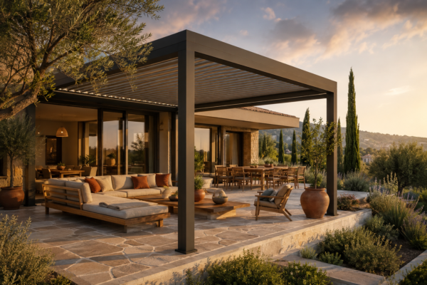
A charcoal aluminum pergola can therefore work as an architectural transition between a dark-framed interior and a natural stone terrace.
Similarly, a warm white pergola can soften a contemporary hospitality environment dominated by concrete and glass.
For designers, color is becoming a tool for architectural continuity.
2. Consumers Want Outdoor Spaces to Feel More Natural
Outdoor living is increasingly about reconnecting with nature.
Stone, wood, plants, sunlight, textiles, and natural textures naturally work together with warmer color palettes.
This is why sage green, taupe, terracotta, warm white, and bronze are particularly effective in outdoor environments.
The goal is not to add more decoration.
Instead:
Warm Minimalism = less decoration + warmer materials.
The architectural structure remains simple, while color and material create depth.
This approach is especially useful for pergola applications because the structure itself provides strong architectural geometry. The surrounding materials can remain relatively restrained without making the space feel empty.
3. Luxury Is Moving From “Cold” to “Quiet”
Luxury outdoor design has also evolved.
For years, premium design was often associated with:
Black + White + Gray + Metal
Today, high-end spaces increasingly use:
Soft contrast + natural materials + sophisticated neutrals
The difference is subtle, but important.
Luxury is becoming less about making every element visually impressive and more about creating an environment that feels considered, balanced, and effortless.
This is particularly relevant to luxury residential projects, boutique hotels, restaurants, resorts, and premium outdoor living collections.
The 5 Colors Defining Warm Minimalism in 2026
If you’re developing a modern pergola collection around the latest outdoor color trends 2026, five color families deserve particular attention.
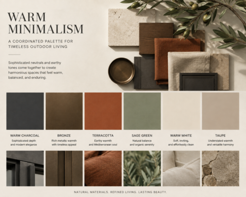
01. Warm Charcoal — The New Architectural Neutral
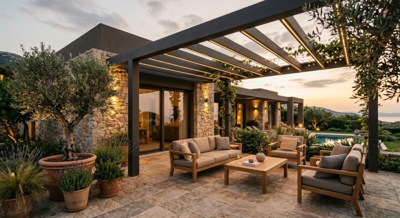
Warm charcoal sits between traditional gray and black.
It has the architectural strength of a dark frame without the visual harshness of pure black.
For aluminum pergolas, it provides a particularly strong foundation for contemporary architecture.
Recommended combination:
Warm Charcoal + Natural Stone + Oak/Wood
This palette works especially well for:
- Modern villas
- Luxury residences
- Hotels
- Restaurants
- Rooftops
- Contemporary commercial spaces
The key is to avoid surrounding charcoal with too many cold materials. Pairing it with warm stone, timber, greenery, and warm lighting creates a more sophisticated result.
02. Bronze — From Industrial to Sophisticated
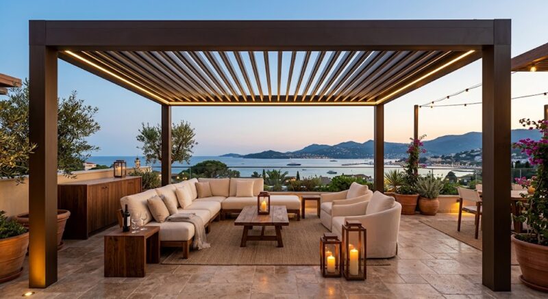
Bronze introduces a warmer metallic character.
It can feel premium, architectural, and luxurious without becoming overly decorative.
A particularly effective combination is:
Bronze + Cream + Walnut + Warm Lighting
This palette is suitable for:
- Luxury residential projects
- Boutique hotels
- Hospitality environments
- High-end commercial spaces
- Rooftop terraces
Bronze is also useful for brands looking to differentiate their pergola collections beyond standard black, gray, and white finishes.
03. Terracotta — Bringing Mediterranean Warmth Outdoors
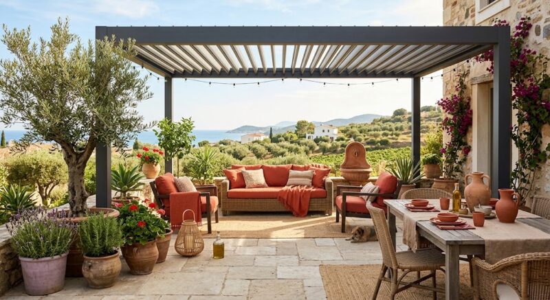
Terracotta brings an earthy, Mediterranean character to outdoor spaces.
But there is an important distinction:
Terracotta does not need to become the main structural color.
Instead, it can be used as an accent.
For example:
Charcoal Pergola + Terracotta Furniture + Limestone
or:
Bronze Pergola + Terracotta Textiles + Olive Green
This allows designers to introduce warmth without overwhelming the architectural structure.
Recent 2026 color reporting also points toward earthy terracotta and sage tones as part of a broader preference for more emotionally warm and nature-connected environments.
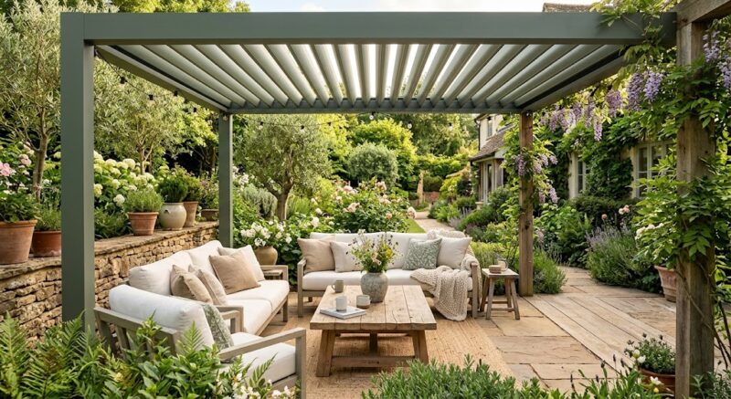
04. Sage Green — The Biophilic Neutral
Sage green is particularly interesting because it behaves almost like a neutral.
It does not compete with nature.
Sage connects architecture with nature.
That makes it ideal for environments where landscape is an important part of the design.
Recommended combination:
Sage + Warm White + Natural Wood + Stone
Potential applications include:
- Garden pergolas
- Resorts
- Villas
- Wellness spaces
- Restaurants
- Poolside environments
For brands targeting biophilic design, wellness, hospitality, or resort markets, sage can also create a clear visual identity.
05. Warm White & Taupe — The Soft Foundation
Warm minimalism should not become a dark-color-only trend.
Warm white and taupe provide the softer foundation needed to balance charcoal, bronze, and terracotta.
For example:
Warm White + Taupe + Charcoal
creates a contemporary palette with enough contrast to feel architectural while remaining soft and inviting.
Warm neutrals are particularly effective in hospitality, coastal properties, luxury residential projects, and spaces where designers want the landscape to remain the visual focus.
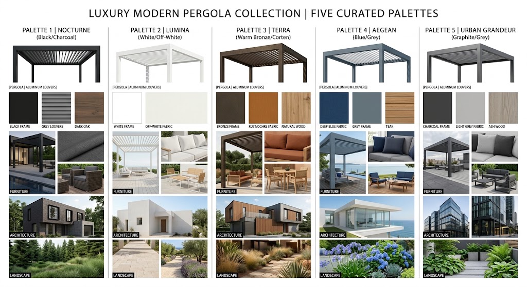
5 Warm Minimalist Color Combinations for Modern Pergolas
The following combinations can serve as starting points for architects, designers, and outdoor living brands.
| Palette | Pergola | Materials | Best For |
|---|---|---|---|
| Urban Warmth | Warm Charcoal | Stone + Oak | Modern Villas |
| Desert Luxury | Bronze | Sandstone + Walnut | Luxury Homes |
| Mediterranean | Charcoal | Terracotta + Limestone | Resorts |
| Botanical Calm | Sage | Wood + Stone | Gardens |
| Soft Contemporary | Warm White | Taupe + Beige | Hospitality |
How to Apply 2026 Color Trends to Pergola Design
Following a color trend is easy.
Turning that trend into a commercially viable pergola collection is much harder.
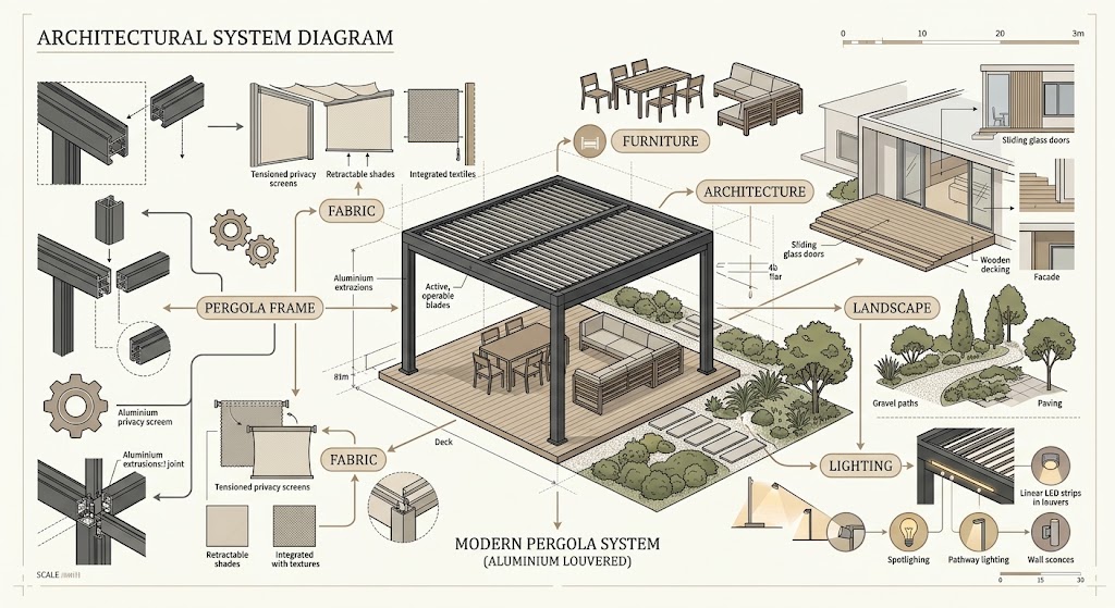
The key is to think about the pergola as part of a complete outdoor design system.
1. Start With the Pergola Frame
The pergola is the architectural anchor of the outdoor space.
Therefore:
Choose the structural color first, then build the rest of the palette around it.
A warm charcoal frame can become the foundation for natural stone, wood, sage landscaping, and warm textiles.
A bronze structure can establish a more luxurious positioning.
A warm white frame can create a lighter, softer visual language.
The frame color should therefore be considered as part of the project’s architectural specification—not simply a product finish.
2. Coordinate Fabric, Furniture and Architecture
A pergola should not be treated as an isolated product.
Its frame, fabric, furniture, and surrounding architecture should work as one visual system.
This is particularly important for B2B buyers.
A retailer may need a pergola collection that works with multiple furniture styles.
An architect may need fabric and frame combinations that complement a specific building.
A hospitality developer may need colors that match an existing brand identity.
Hooeasy currently offers more than 100 awning fabric designs, with polyester, acrylic, and Spanish acrylic options available. Its published fabric specifications include different fabric weights, color-fastness levels, waterproof performance, coatings, and optional UV/fire-resistant options depending on the fabric type.
3. Use Color to Define Different Market Positions
Color is not simply an aesthetic choice.
For B2B brands, color can become a product positioning tool.
For example:
Warm Charcoal
→ Modern / Urban / Architectural
Bronze
→ Premium / Luxury
Sage
→ Wellness / Nature / Resort
Terracotta
→ Mediterranean / Lifestyle
Warm White
→ Soft Luxury / Contemporary
This allows brands to build different collections around the same fundamental pergola architecture.
From Color Trend to Product Strategy: What B2B Buyers Should Consider
This is where color trends become commercially relevant.
For outdoor living brands, importers, distributors, contractors, and project developers, a successful pergola product needs to respond to more than visual trends.
For Outdoor Living Brands
Brands should consider:
- Consistent color collections
- Multiple fabric choices
- Customization
- Trend-responsive products
- Visual merchandising
- Product differentiation
A broader palette allows a brand to build seasonal collections without completely redesigning its product architecture.
For Importers & Distributors
Importers and distributors typically need to evaluate:
- Color range
- MOQ
- Product consistency
- Material durability
- Customization capability
- Market adaptability
The ability to offer several coordinated colors can make it easier to serve different customer segments without maintaining completely different product systems.
For Contractors & Project Developers
Project-oriented buyers should look beyond color alone.
Key considerations include:
- Architectural coordination
- Large-project consistency
- Material performance
- Color matching
- Installation
- Long-term maintenance
For a hotel or residential development, a small color mismatch across multiple structures can affect the overall visual quality of the project.
That makes finish consistency and supplier capability commercially important.
Why a Broader Color & Fabric Portfolio Matters for Pergola Brands
A pergola collection is not defined only by its roof design.
It is the combination of:
Frame + Fabric + Furniture + Architecture + Landscape
that creates the final outdoor experience.
A broader finish and fabric portfolio gives brands more freedom to create differentiated outdoor living collections.
Hooeasy’s current portfolio highlights more than 100 fabric designs, alongside more than 1,600 existing RAL colors for pergola frames and different finish options.
This creates potential for multiple design directions, including:
- Neutral tones
- Warm tones
- Nature-inspired colors
- Contemporary colors
- Different textures
- Different project styles
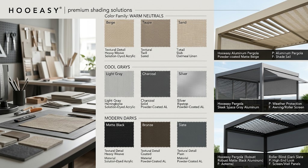
For B2B buyers, the value is not simply “more colors.”
The real value is more ways to build a product collection around different markets, architectural styles, and customer preferences.
3 Design Rules for Creating a Timeless Warm Minimalist Pergola
Rule 1: Choose One Dominant Architectural Color
Avoid making every element compete for attention.
Select one dominant structural color and allow the surrounding materials to support it.
For example:
Charcoal frame + natural wood + sage landscaping
is often more sophisticated than combining multiple competing colors.
Rule 2: Layer Warm Materials Instead of Adding More Decoration
Warm minimalism does not require more decorative elements.
Instead, create depth through:
- Wood
- Stone
- Textiles
- Plants
- Warm lighting
The structure remains simple while the materials create visual richness.
Rule 3: Let Technology Stay Visually Quiet
Technology should improve comfort without disrupting the visual simplicity of the space.
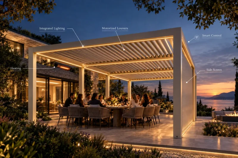
Modern motorized pergola systems can incorporate:
- Motorized louvers
- LED lighting
- Sensors
- Remote controls
- Smart control systems
Hooeasy’s motorized pergola systems include options such as remote operation, LED lighting, APP control, and side screens depending on the model.
The technology should be present when needed—and visually quiet when not.
That is how a functional product becomes an architectural product.
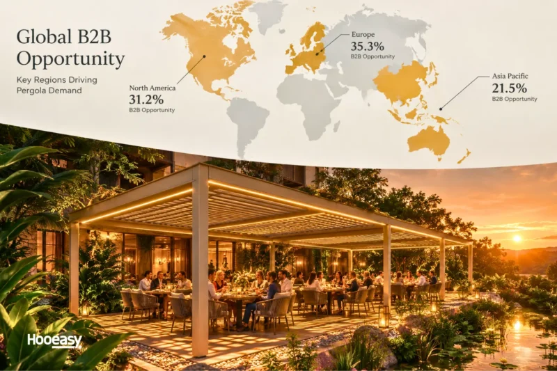
2026 Outdoor Color Trends by Market
Color trends are global, but market preferences are not identical.
Europe
Recommended palette:
Warm White + Sage + Natural Stone
Design direction:
Mediterranean / Biophilic / Soft Luxury
European outdoor environments often benefit from palettes that connect architecture with gardens, terraces, stone, and natural materials, reflecting the latest outdoor living trends in Europe.
North America
Recommended palette:
Warm Charcoal + Wood + Stone
Design direction:
Modern / Architectural / Premium Outdoor Living
This combination works particularly well for contemporary residential patios, backyard entertainment areas, and luxury outdoor kitchens.
Middle East
Recommended palette:
Bronze + Sand + Warm White
Design direction:
Luxury / Resort / High-End Hospitality
Warm metallic finishes and desert-inspired neutrals can create a strong architectural relationship with sand-colored stone, concrete, and premium hospitality environments.
Australia
Recommended palette:
Charcoal + Timber + Olive/Sage
Design direction:
Natural / Coastal / Contemporary
The combination of dark architectural framing and natural timber can create a contemporary outdoor aesthetic while remaining visually connected to the landscape.
How Hooeasy Helps Brands Build Trend-Ready Pergola Collections
The most useful question for a B2B buyer is not simply:
“Which color is trending?”
It is:
“Can my supplier help me turn this trend into a commercially viable product collection?”
Hooeasy approaches this through four key areas.
01 — Broad Color & Fabric Selection
Hooeasy offers more than 100 fabric designs and a wide selection of pergola frame colors and finishes.
02 — Architectural Design Flexibility
Different pergola configurations can be applied to residential, hospitality, commercial, and outdoor living environments. Hooeasy’s portfolio includes aluminum louvered systems, wall-mounted pergolas, large-span options, and motorized configurations.
03 — B2B Customization
For brands, distributors, and project partners, customization can be an important part of developing differentiated products.
Depending on project requirements, this can involve dimensions, finishes, fabric selections, product configurations, branding, or packaging, allowing us to deliver tailored custom pergola solutions for B2B projects.
Depending on project requirements, this can involve dimensions, finishes, fabric selections, product configurations, branding, or packaging.
04 — From Trend to Commercial Product
The ultimate goal is to turn:
Design Trend
↓
Color Palette
↓
Pergola Collection
↓
Commercial Product
Instead of reacting to trends after the market has moved, brands can use color direction as an input into product planning.
Build Your 2026 Outdoor Collection Around Color
The next generation of outdoor living isn’t defined by a single color.
It is defined by how materials, architecture, technology, and nature work together.
Warm minimalism is therefore more than a palette.
It is a design strategy.
For outdoor living brands, distributors, architects, and project professionals, the opportunity is to turn these 2026 outdoor color trends into products that customers actually want to live with.
The most successful pergola collections will not simply follow a trend.
They will create a coherent visual system—from the frame and fabric to the furniture, architecture, landscape, and lighting.
Looking for pergola solutions that fit your market’s design direction?
Talk to Hooeasy About Your Next Outdoor Living Collection →
FAQ: 2026 Pergola Color Trends
What are the most popular outdoor colors for 2026?
Warm charcoal, bronze, terracotta, sage green, warm white, and taupe are among the key directions shaping contemporary outdoor design in 2026. The broader trend is toward warmer, nature-connected neutrals rather than exclusively cool monochromatic palettes.
What colors are trending for pergolas in 2026?
Warm charcoal, bronze, sage, and warm neutrals are particularly relevant to current pergola design trends. These colors provide architectural structure while working naturally with stone, wood, landscaping, and outdoor furniture.
Is gray still popular for outdoor spaces in 2026?
Yes. Gray is not disappearing.
However, cool gray is becoming less dominant, while warmer grays, charcoal, and taupe offer more contemporary alternatives.
What is warm minimalism in outdoor design?
Warm minimalism combines clean architectural lines with warm colors, natural materials, and layered textures.
The objective is to maintain visual simplicity while creating a warmer and more inviting outdoor environment.
What color pergola looks most modern?
Warm charcoal, deep bronze, and matte black paired with warm natural materials can create a highly contemporary look.
The surrounding architecture and landscape should also be considered when selecting the final color.
What colors work well with an aluminum pergola?
Several combinations work particularly well:
- Charcoal + wood
- Bronze + stone
- Sage + warm white
- Black + terracotta
- Taupe + natural stone
The best combination depends on the architectural style, landscape, furniture, and intended market positioning.
How do I choose a pergola color for a luxury outdoor space?
Consider five factors:
- Architecture
- Landscape
- Furniture
- Climate
- Brand positioning
The pergola should look like part of the overall environment rather than a separate product placed into it.
Can pergola manufacturers offer custom colors and fabrics?
Depending on the manufacturer and project requirements, custom finishes and fabric selections may be available.
Hooeasy offers a broad selection of fabric designs and multiple pergola frame color options for B2B outdoor living applications.
For specific projects, buyers should confirm available finishes, fabric specifications, MOQ, customization requirements, and technical performance directly with the manufacturer.